Packaging Design: Dove Soap 2023
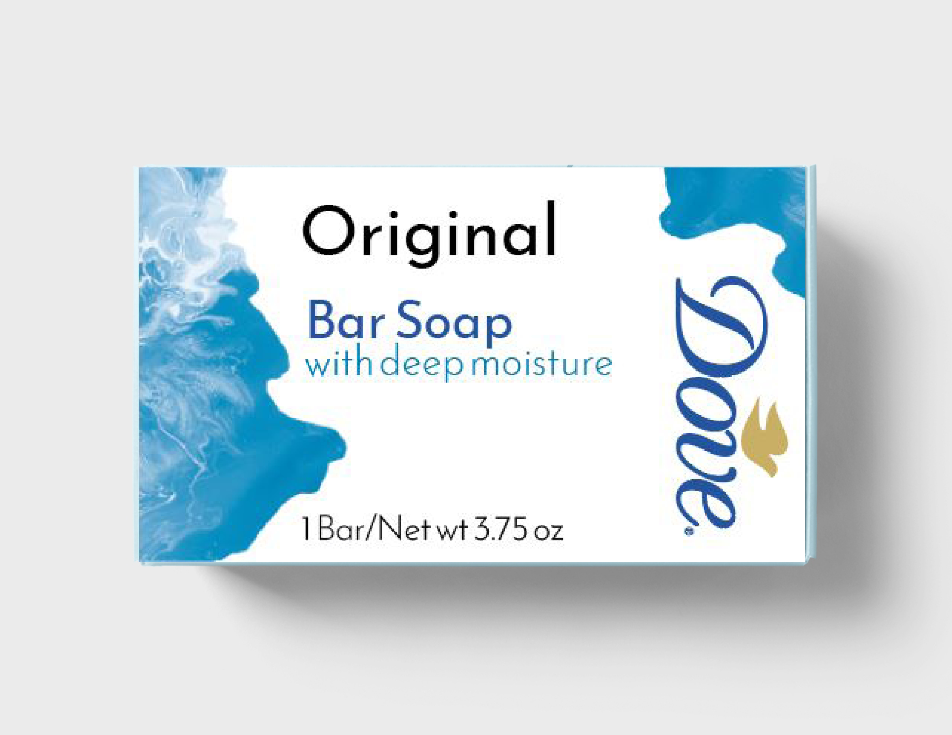
Dove has some gaps in their packaging. Although the logo is clear and beautiful, it does not stand out because of their mix with a simplistic typeface and images. Dove could also very easily widen their audience and bring in more buyers by just updating to become more modern. The colors could be updated so the logo pops, making a more powerful shelf presence that overshadows Dove’s competitors. The biggest issue is changing the images to something more enticing and not one that has been done many times before.
Research
In a team of five, we split up doing research into Dove, their competitors, and the history of soap and compiled them onto a Miro Board which we shared. We looked at each soap’s logo, typeface, colors, graphics, shelf presence and layout. The three competitors we looked at were Olay, Nivea and Lux. One of our biggest takeaways was that Dove did not have a huge shelf presence.
Ideation
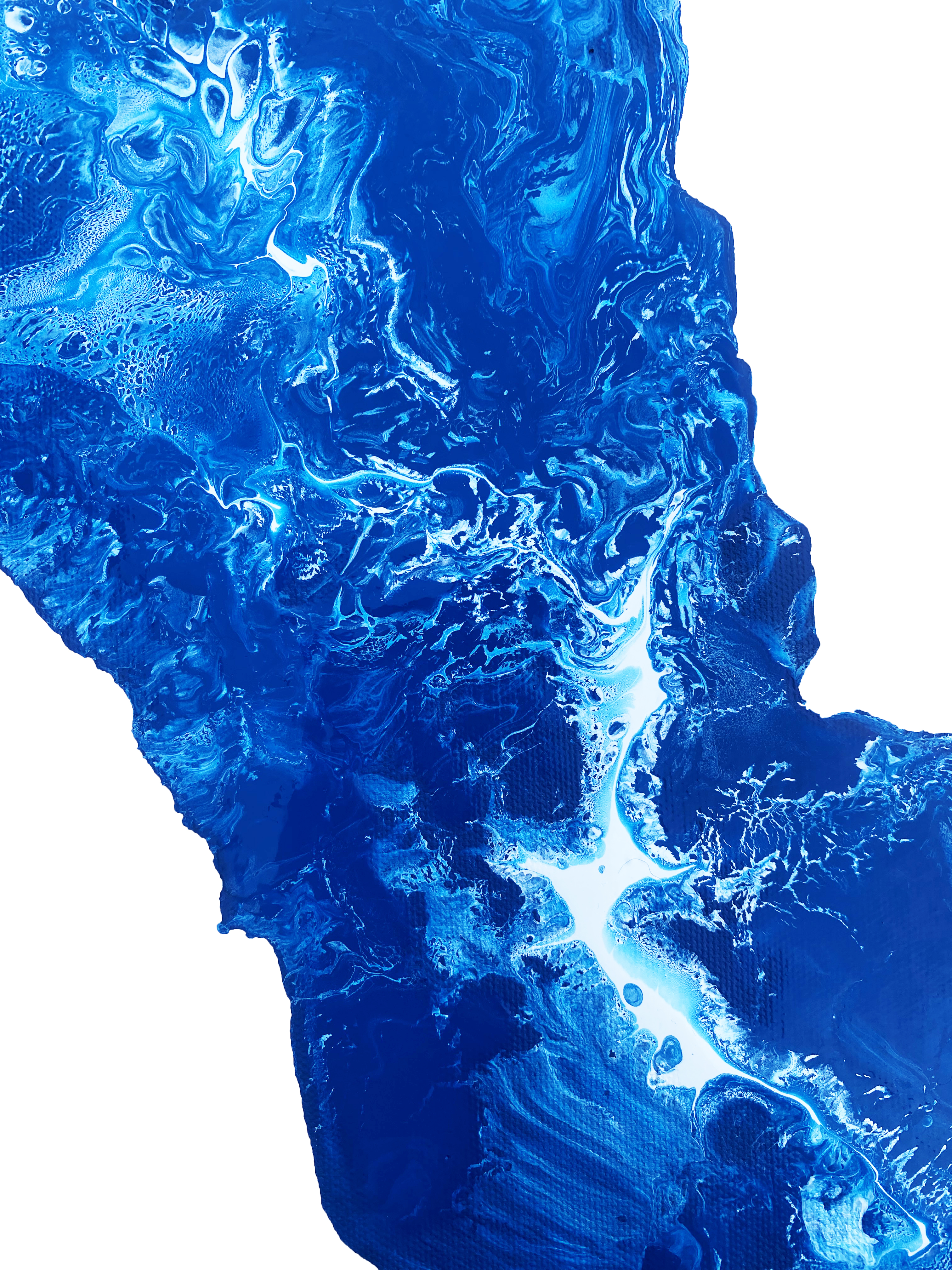
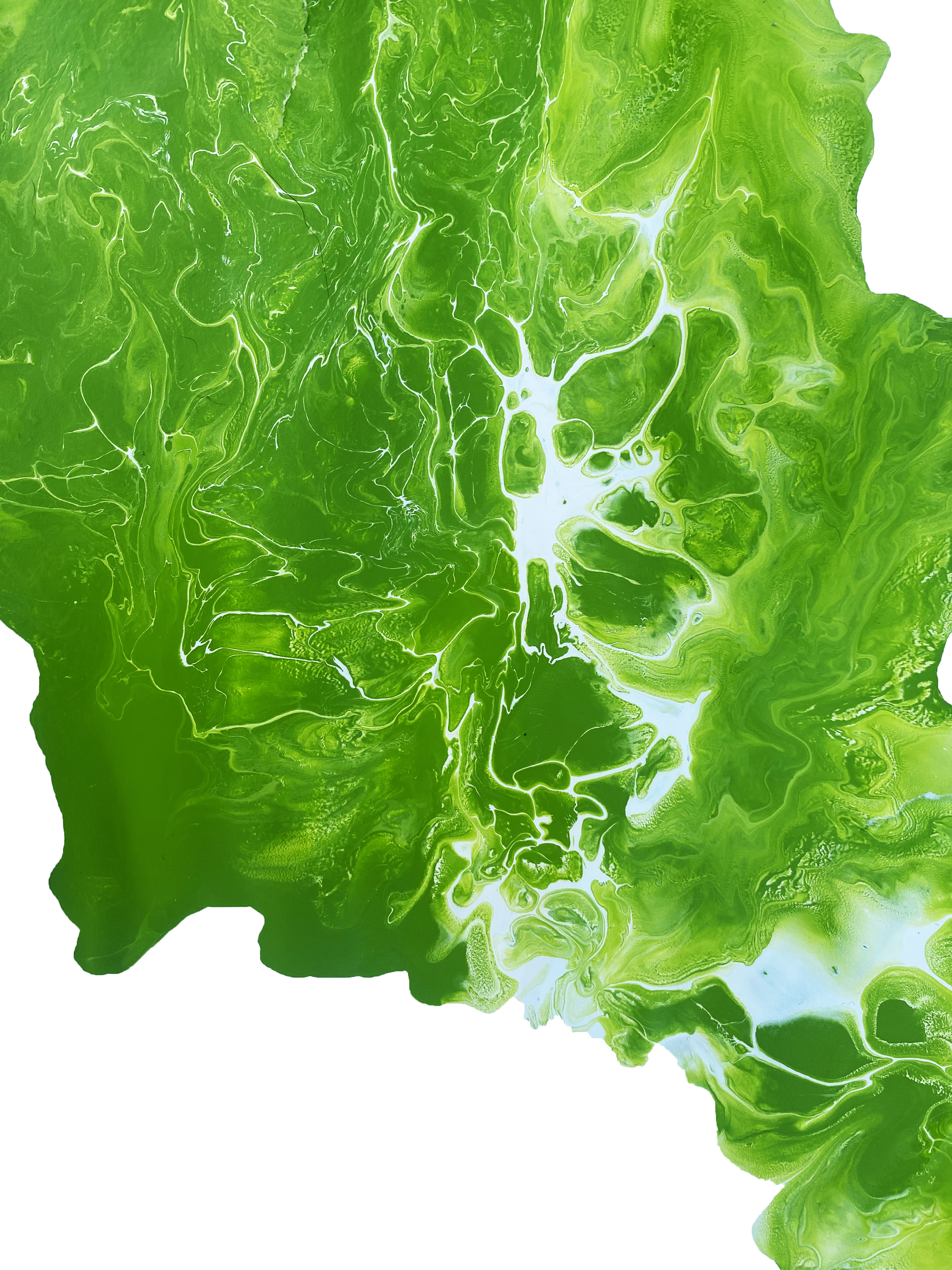
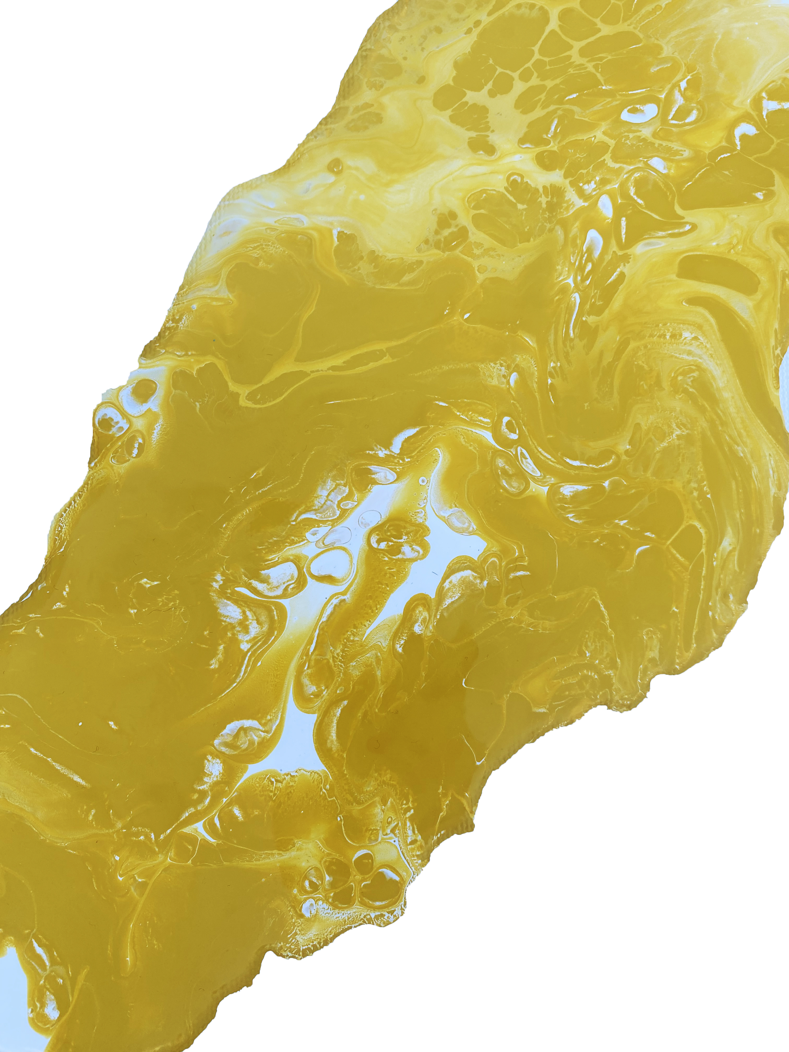
The inspiration to doing sketches and ideation started with the suds when using soap. I wanted to focus on how the white suds sit in water and then how it swirls going down the drain. So when starting to sketch I aimed towards gradients and swirling and curving lines. Ultimately, I did like these ideas but I wanted to get more organic with it and step away from my computer.
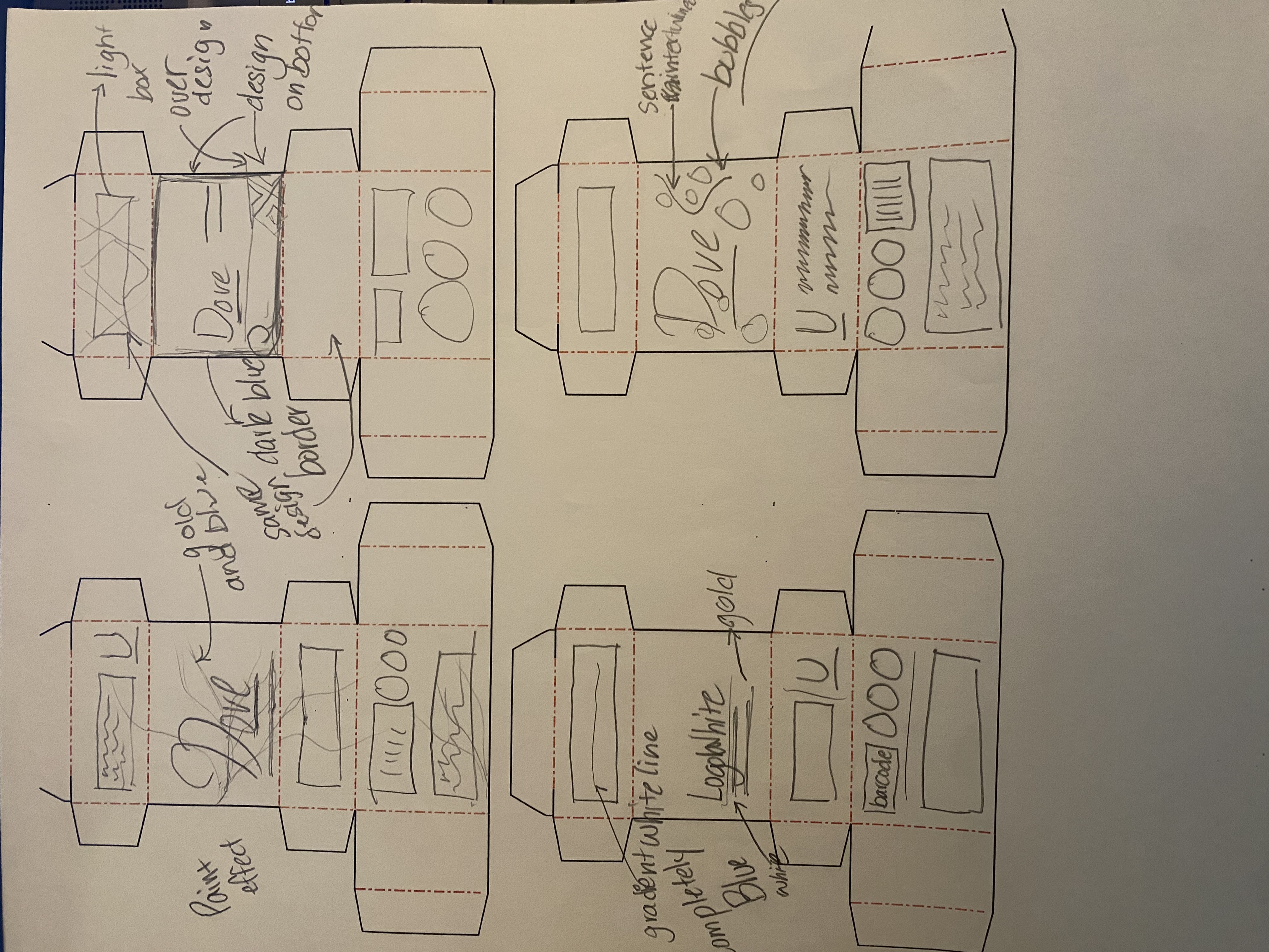
Iteration
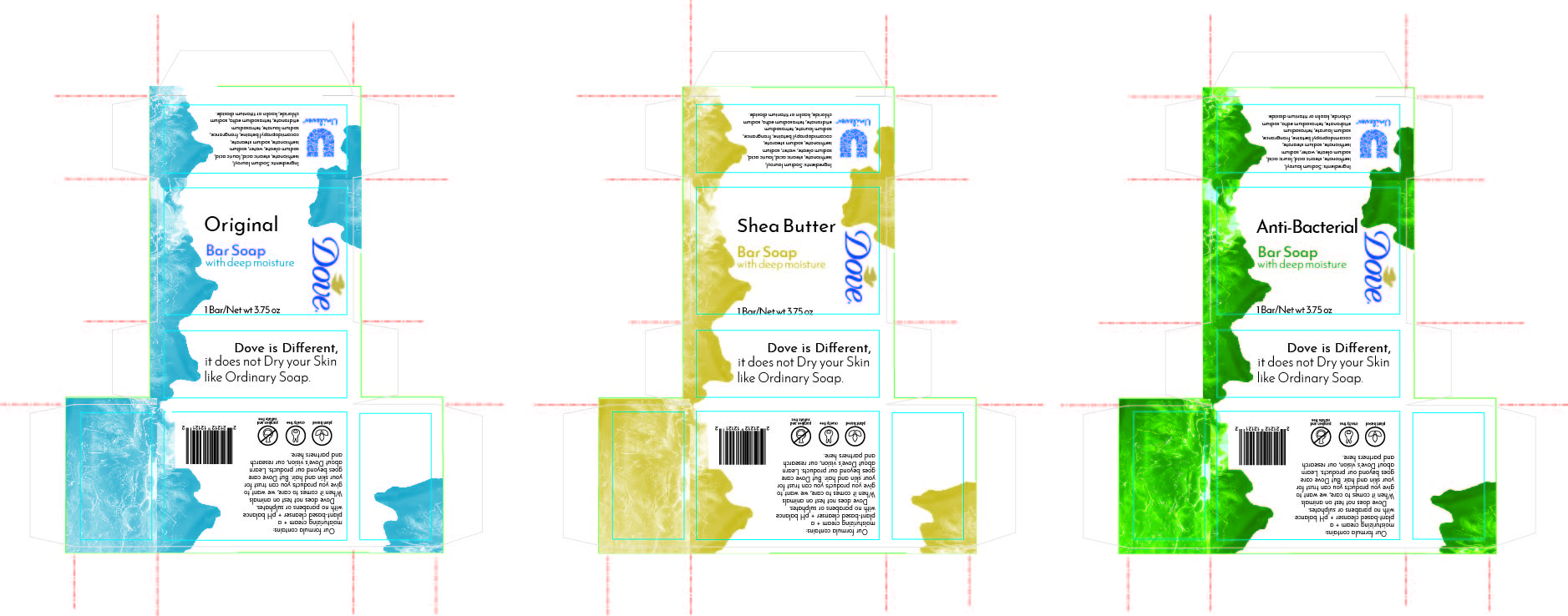
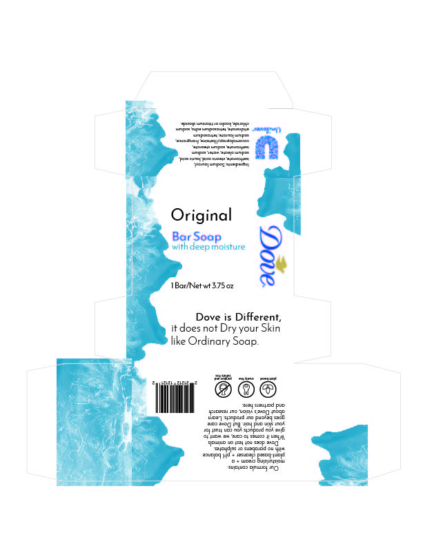
I used something called a Dutch pour where I poured two colors of paint and blow-dried the paint to create a beautiful pattern. The problem that I ran into building the boxes is that the yellow and blue paint edges were not as appealing and beautiful as the green one that spread out more.
Final Product
In doing the final touchups, the most important thing I considered was alignment. In previous iterations, that was the biggest struggle considering the organic shape.